Wemo/Belkin
App Ui Design
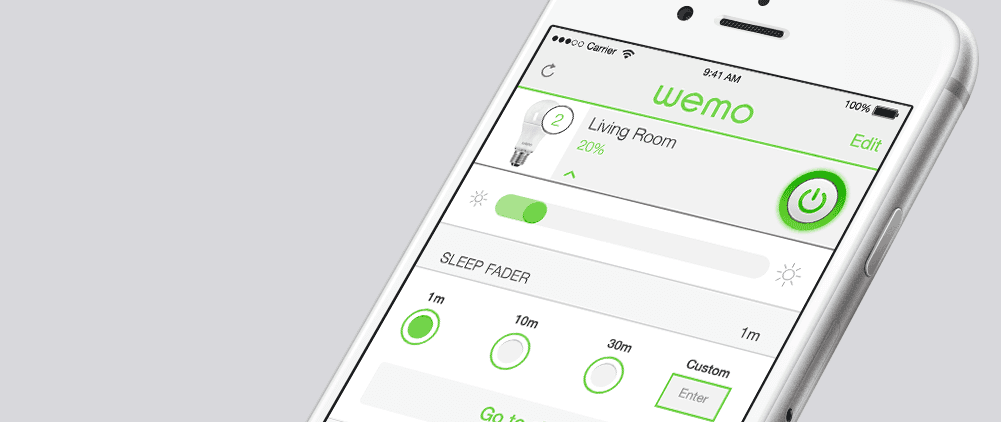
WeMo is a line of home automation products ranging from switches to space heaters. App functionality included measuring energy consumed and scheduling timers. Both iOS and Android versions were developed.
Challenge Faced
iOT was in its infancy. We were challenged with making a complex system of products easy to learn and use while creating an ownable look and feel for the brand. Ultimately we wanted to make an app that people wanted to use everyday, not just a set it and forget it piece of software. In addition, we needed to create a design that would flex with the addition of new products.
Strategies Employed
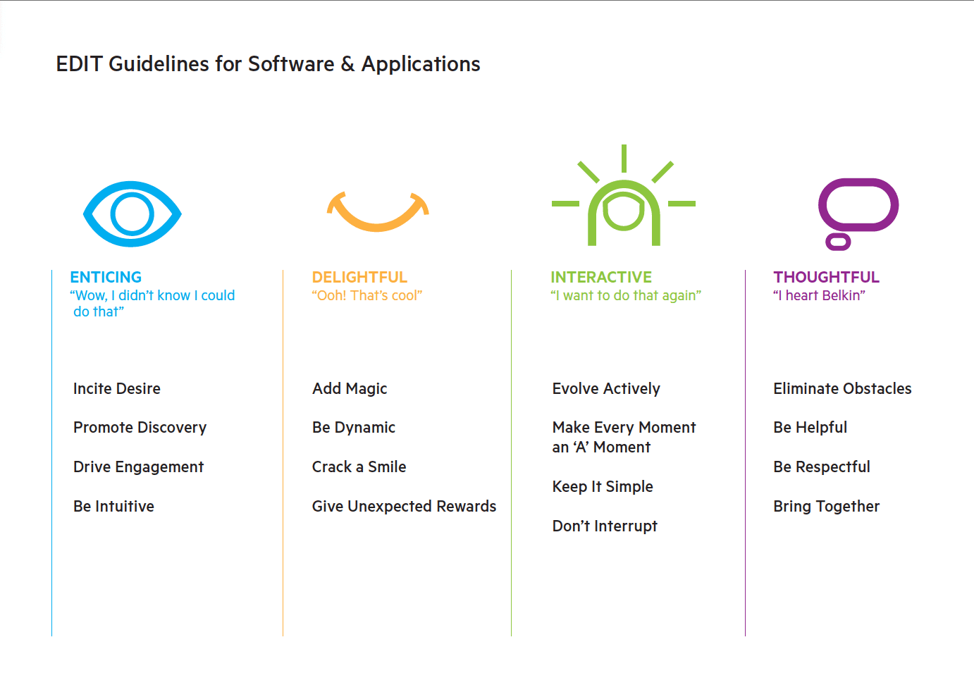
We first worked out the core design and proposition values of the WeMo brand. The WeMo “Edit Guidelines” provided a north star towards the type of engaging and delightful product we wanted to create. We created a simplified design that both spoke to early adopters and casual users alike. We then worked on building a design system that could be applied across products from lightbulbs to coffee makers.
Process
A healthy dose of post-it notes, white boarding, sketching, and wire-frames were created before going into final design.
White boarding was used not just to flush out the integrity of the product, but also the integrity of the process. Being human centered isn’t just relevant for the end user, but also for the team building the product.
User flows were created by actually posting wireframes or sketches to whiteboards to create a more team focused interactive event.
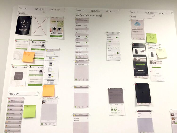

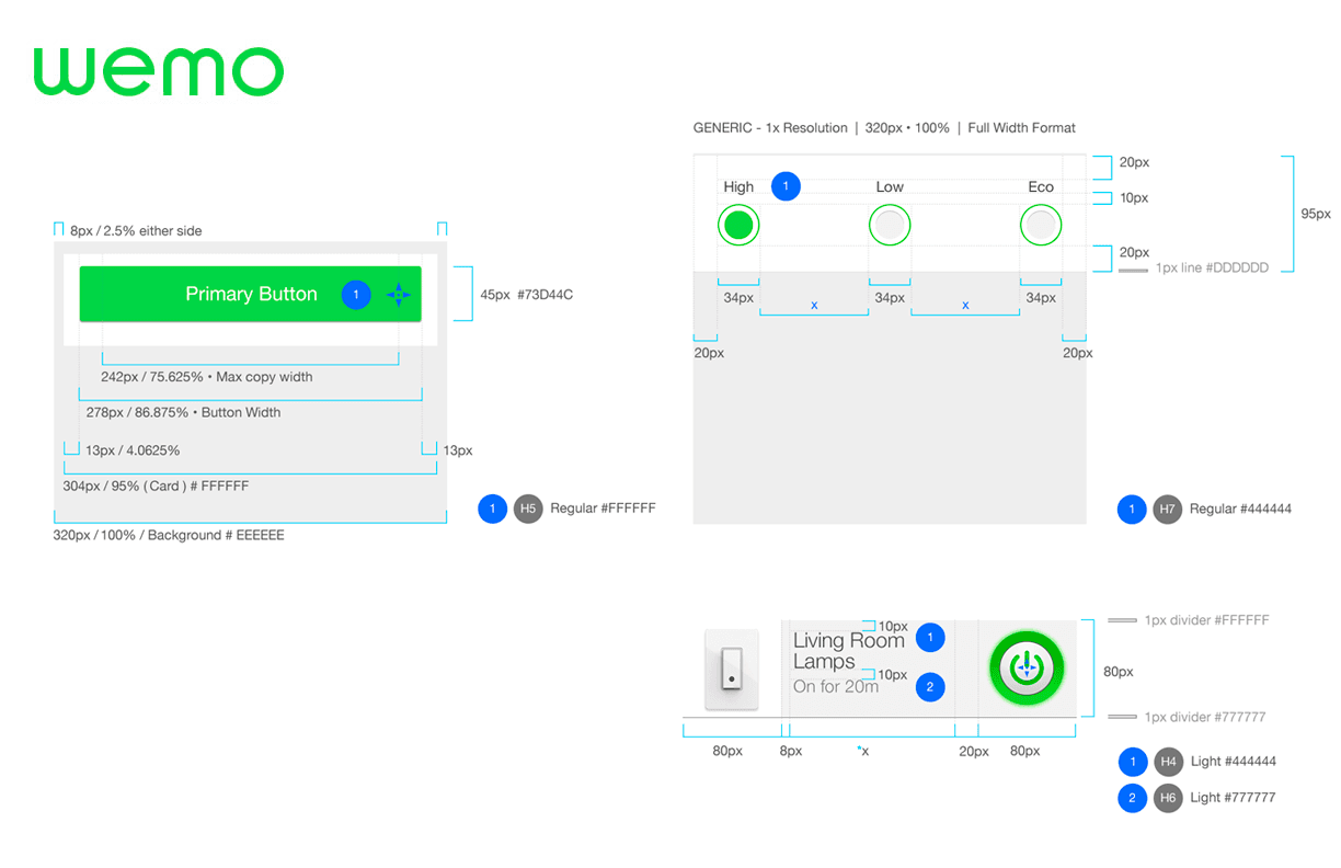
Design System
Spec examples here are actually part of a living document using a Confluence Wiki to integrate UX/UI specs. Since a modular approach was followed in creating the UI elements, each module spec could live in one place but be mirrored throughout the product flow. At any point, if the spec was modified, its instance would be updated throughout the Wiki.
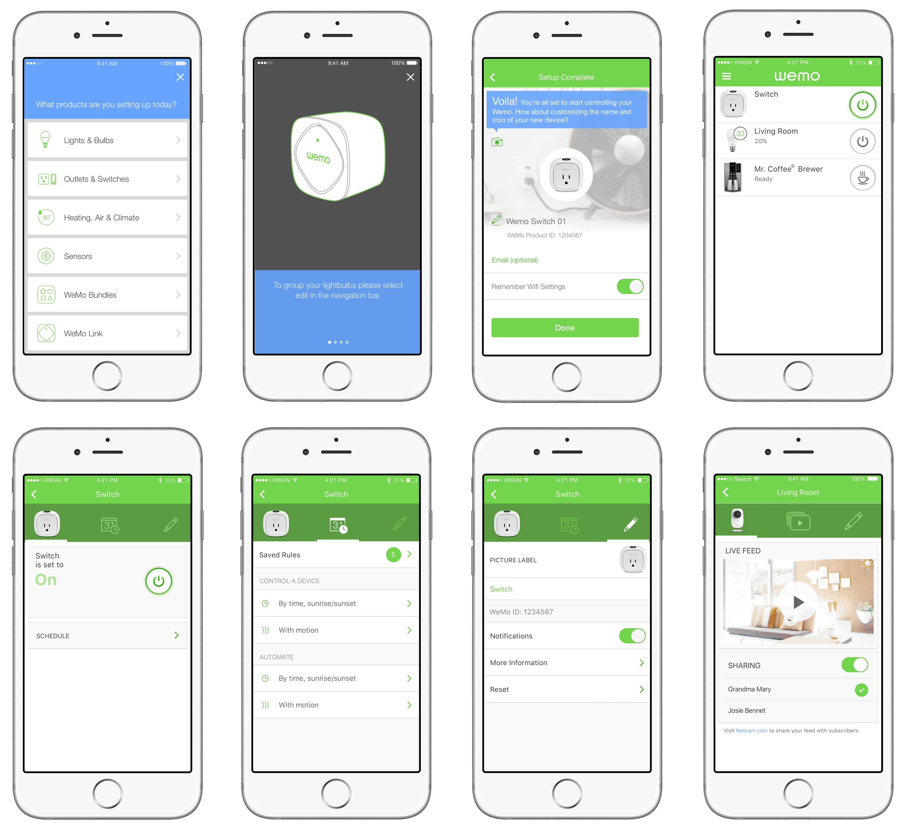
Final Ui
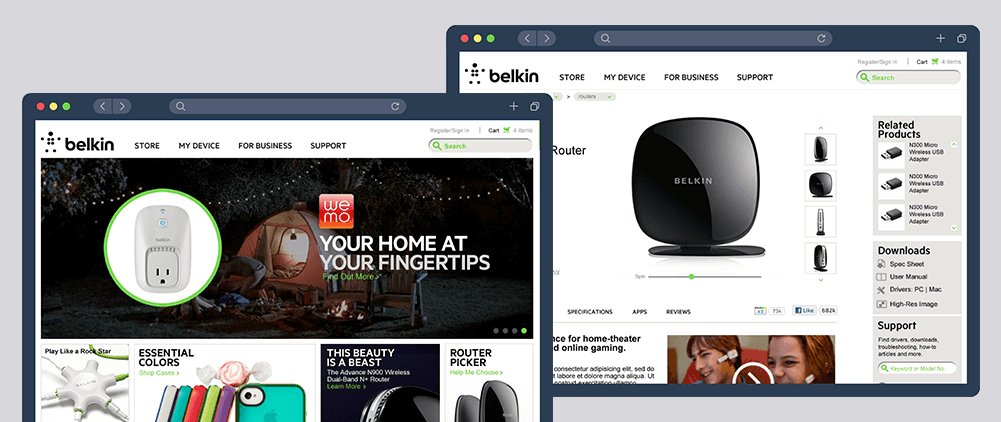
Wemo went through several aesthetic iterations, evolving with design trends from skeuomorphism to flat design. Despite design trends, WeMo always maintained a relationship in aesthetic to the products it was interfacing with. Emphasis has always been on clean and friendly with hints of tech physicality. Hits of WeMo green helped both brand the design as well as keep it colorful and inviting. The blue color was reserved for messaging that needed to be called out often for instructions or guidance.
Concept Ui
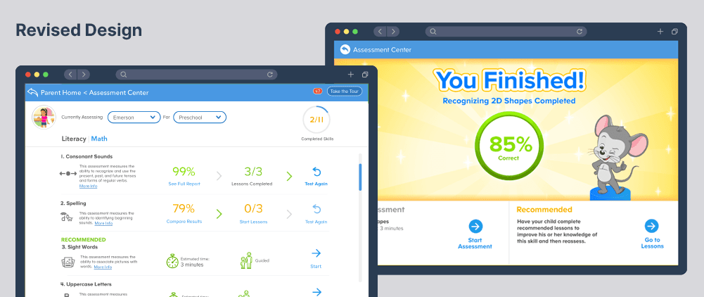
As the Wemo App took on more and more products, its Ui required a complexity that some users found a bit bloated for their needs. I was asked to create a concept for a simpler app that focused on our core products. The aim was to make a product that was simple and fun to use.