

Building a robust home automation app from the ground up, Wemo was at the forefront of iOT.
Project type
Ux/Ui Design
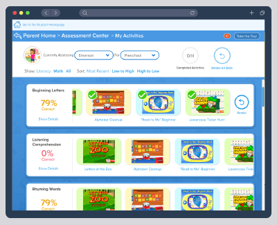
The Assessment Center allows children to take quick tests in several grade levels to assess their aptitude in Math and Literacy skills. If a child needs help in a skill, activities in ABCmouse are instantly assigned to the child to help them improve. The parent is given data on how the child performed that can facilitate further action to help the child along in the learning process.
Challenges Faced:
The Assessment Center aimed to be a product families would use on a regular basis, constantly gauging how their children were progressing. User engagement by both adults and children were not where we wanted them to be. Many started but never completed the process of taking an assessment, let alone multiple assessments, or reassessing if the child did not do well. Parents couldn’t find enough time in the day; children became distracted easily and lacked motivation to complete the assessments or recommended activities.
Strategies Employed:
We first worked out the core design and proposition values of the WeMo brand. The WeMo “Edit Guidelines” provided a north star towards the type of engaging and delightful product we wanted to create. We created a simplified design that both spoke to early adopters and casual users alike. We then worked on building a design system that could be applied across products from lightbulbs to coffee makers.

Process:
A healthy dose of post-it notes, white boarding, sketching, and wire-frames were created before going into final design.
White boarding was used not just to flush out the integrity of the product, but also the integrity of the process. Being human centered isn’t just relevant for the end user, but also for the team building the product.
User flows were created by actually posting wireframes or sketches to whiteboards to create a more team focused interactive event.

Design System:
Spec examples here are actually part of a living document using a Confluence Wiki to integrate UX/UI specs. Since a modular approach was followed in creating the UI elements, each module spec could live in one place but be mirrored throughout the product flow. At any point, if the spec was modified, its instance would be updated throughout the Wiki.

Final Ui:
Wemo went through several aesthetic iterations, evolving with design trends from skeuomorphism to flat design. Despite design trends, WeMo always maintained a relationship in aesthetic to the products it was interfacing with. Emphasis has always been on clean and friendly with hints of tech physicality. Hits of WeMo green helped both brand the design as well as keep it colorful and inviting. The blue color was reserved for messaging that needed to be called out often for instructions or guidance.


